
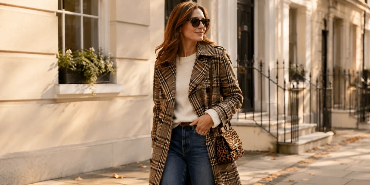
Learn how to wear prints without overthinking it, from the scale rule and colour combinations to leopard, polka dots, checks and the prints trending in 2026.
Most people own a few printed pieces but rarely wear them together. Prints can make an outfit feel more interesting and personal, but combining different patterns is not always intuitive. A floral, stripe, check or animal print can change the feel of an outfit depending on its size, colour and how it works with the other pieces around it.
Learning how to wear prints starts with a few simple principles. This guide explains how to choose and style prints, how to combine different patterns through scale and colour, and how to make prints work with the wardrobe you already have. It also covers some of the most wearable prints and the patterns trending in 2026.
Quick Answer: To wear prints, start with one patterned piece and keep the rest of the outfit relatively simple. When combining two prints, different scales create separation, while a shared colour creates a connection. Shape adds another layer of contrast: a structured stripe beside an organic floral creates a clear distinction between the two patterns.
What Prints Are Trending in 2026?
Prints in 2026 include familiar patterns alongside bolder scales, richer colours and less traditional interpretations. The interesting part is not simply choosing a “trendy” print, but seeing how a familiar pattern can feel different through colour, scale and proportion.
Stripes are getting more noticeable. Classic Breton stripes still fit easily into everyday wardrobes, while wider, colourful and graphic stripes create a stronger focal point. Navy-and-white and black-and-white remain easy choices, while red-and-white, blue-and-white and multicoloured stripes give a more noticeable take on the classic pattern. A fine stripe works well for a minimal wardrobe; a wide stripe can become the main feature of an outfit.
Polka dots range from tiny to oversized. Small dots keep the pattern delicate, while medium and large dots give dresses, skirts and blouses more visual presence. Black-and-white, red-and-white and navy-and-white are particularly easy to recognise and style, while irregular spots bring the familiar dot into animal-print territory.
Checks are appearing in different scales and colour combinations. Plaid, tartan, gingham, houndstooth and windowpane each create a different effect. Red tartan has a particularly recognisable look, while burgundy, green, navy, brown and cream create softer or deeper versions. A small gingham check works differently from an oversized tartan coat simply because the scale changes the amount of visual weight.
Animal prints extend beyond classic leopard. Brown-and-black leopard remains one of the easiest choices for a neutral wardrobe, while zebra, snakeskin and irregular spotted patterns create a more graphic effect. Less traditional colourways also change the mood of an animal print, turning a familiar pattern into a more noticeable statement.
Florals are becoming more prominent through scale and colour. Oversized blooms, darker backgrounds and abstract floral shapes give the pattern more visual presence than tiny scattered flowers. Red, burgundy, deep green, cream, pink, blue and yellow create very different effects, from rich and dramatic to bright and playful.
Paisley and bandana-inspired motifs also fit naturally into the current print mix, particularly on scarves, shirts, bags and fluid dresses. Navy, red, cream and brown keep the pattern familiar, while larger motifs give it more presence.
How to Bring 2026 Prints Into Your Wardrobe
You do not need to replace your wardrobe to wear the prints of 2026. A fine stripe, small polka dot, subtle check or classic leopard can fit easily into a wardrobe built around neutrals. A red-and-white stripe, burgundy floral or colourful gingham adds more colour without changing the basic structure of an outfit.
For a stronger statement, a large floral, oversized plaid, wide stripe or animal-print coat can become the focal point while the rest of the outfit stays simple.
The styling principles remain the same: scale creates contrast, colour creates connection, and one print can anchor an otherwise simple outfit.
How to Wear Prints If You Never Have Before
If prints are new to your wardrobe and you’re not sure how to wear them, starting with one patterned piece makes it easier to see how it changes an outfit.
- Start with one print. A printed skirt, blouse or pair of trousers with plain pieces gives the pattern a clear place in the outfit.
- Try an accessory. A printed scarf, leopard belt or pair of spotted flats adds pattern without making it the main focus. It is also an easy way to test a print before investing in a larger piece.
- Keep the rest of the outfit simple. A solid top, trousers or jacket gives the print space and keeps the overall look clear.
- Use colours already in your wardrobe. A warm brown leopard connects naturally with camel, beige and cream, while a navy-and-white stripe works easily with denim, navy and white.
- Consider the occasion. A printed skirt with a white T-shirt and trainers has a more relaxed feel, while the same skirt with a tailored blazer and heels creates a more polished outfit.
- Let the print be the focal point. When a pattern is particularly bold, keeping the other pieces quieter allows its colours and shapes to stand out.
Once a single print feels familiar, combining patterns becomes the next step. That is where scale, colour and the relationship between different shapes become more important.
Mixing Two Prints: The Scale Rule
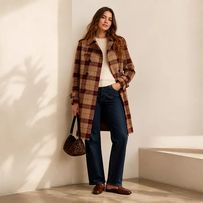
When learning how to mix prints, scale is one of the easiest places to start.
Two prints create clearer separation when they are noticeably different in size. A large pattern beside a small one gives each print its own visual space. When two patterns are very similar in scale, they compete for attention because neither establishes a clear visual hierarchy.
A wide stripe with a tiny floral creates a strong contrast. A medium stripe beside a medium floral has less separation because the two patterns occupy similar visual space.
Understanding Print Scale
The exact size varies from garment to garment, but prints can be grouped into three broad categories:
- Small scale: pin dots, fine stripes, tiny florals and small checks
- Medium scale: standard polka dots, medium checks and regular-sized florals
- Large scale: oversized florals, wide stripes, large checks and bold animal spots
Combining different scale groups creates a clearer relationship between two prints. A fine stripe with an oversized floral, for example, creates more visual contrast than two medium-sized patterns.
Two accessories in the same print at the same scale are a different case. Because the pattern is intentionally repeated, the pieces read as coordinated rather than as two competing prints.
How to Mix Prints by Colour
Prints do not need to match exactly. A shared colour is one of the simplest ways to connect two different patterns.
Repeating one colour creates a visual link. A navy-and-white stripe with a floral that also contains navy has an immediate connection. The same approach works with red, burgundy, green, brown, yellow, pink or blue.
Neutrals provide a quieter connection. Black, white, cream, beige, grey, brown and navy work well between stronger patterns and help keep the overall palette focused.
One colourful print and one neutral print creates a clear focal point. A red floral with a black-and-white stripe, for example, allows the floral to provide most of the colour while the stripe remains graphic and restrained.
Two colourful prints work best when there is something connecting them. They do not need to share every colour. One repeated shade, a similar colour temperature or a neutral element can bring the two patterns together.
Some combinations:
- Navy stripe + blue floral → blue connects the two prints
- Black-and-white check + red floral → the neutral check gives the red floral the stronger colour role
- Brown leopard + burgundy floral → both sit within a rich, warm palette
- Blue gingham + yellow floral → contrasting colours create the visual interest
- Red-and-white dots + burgundy plaid → related reds connect the patterns while the different scales keep them distinct
The basic idea is simple: scale separates the prints, while colour connects them. A solid jacket, bag or pair of shoes also creates a visual pause between two patterns.
A quick photograph can make the overall balance easier to judge. At a smaller size, the general shapes become more obvious than the individual details. If two prints blur into one texture, their scales are probably too similar.
Print Combinations That Work Well Together
Different prints become easier to combine once you look at their scale, shape and colour. These combinations are useful starting points, with room to adjust the colours and proportions to suit the rest of the outfit.
| Combination | Why it works | Keep in mind |
|---|---|---|
| Stripe + floral | Straight lines contrast with organic shapes | A fine stripe with a larger floral creates clear separation |
| Leopard + stripe | Leopard’s brown, tan and black tones work much like a neutral | Black-and-white or navy-and-white stripes keep the combination clear |
| Check + dot | Both are regular geometric patterns | A shared colour connects the two |
| Floral + check | Organic and structured shapes create contrast | A noticeable difference in scale keeps the patterns distinct |
| Animal + geometric | Irregular and structured patterns create visual contrast | A quieter geometric print keeps the animal print prominent |
| Stripe + stripe | Different widths create visual hierarchy | A fine navy stripe with a wider red or black stripe creates more separation than two similar stripes |
The point is not to follow a fixed list of combinations. Contrast creates separation, while colour creates a connection between the prints. Scale, shape and the amount of each pattern in the outfit all contribute to the final balance.
How to Wear Leopard Print
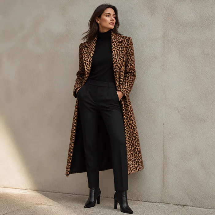
Leopard works much like a wardrobe neutral because classic versions contain familiar colours such as tan, brown, black and cream.
What Colors Go With Leopard Print?
Leopard pairs easily with black, camel, cream, beige, denim, olive, burgundy, red and navy.
The colour of the leopard changes the overall effect. Warm brown and tan leopard sits naturally with camel, beige, cream and olive, while black-heavy or higher-contrast leopard works particularly well with black, grey, white and navy. Red and burgundy create stronger contrast when leopard is the main statement of the outfit.
How to Wear Leopard Print Pieces
The easiest way to introduce leopard depends on how much print you want in the outfit.
- Leopard shoes: Straight-leg jeans with a simple knit or T-shirt let the shoes provide the focal point.
- Leopard bag or belt: A plain black, cream or denim outfit gives a smaller leopard accessory room to stand out.
- Leopard coat: Black trousers, denim or a cream sweater keep the rest of the outfit relatively simple.
- Leopard trousers or jeans: A plain white shirt, black top or simple knit balances the stronger visual impact.
Leopard also works with other prints. A stripe provides a clean geometric contrast, while a small check or polka dot introduces another pattern. A second animal print creates more visual intensity, particularly when the two patterns have similar scales.
Matching leopard shoes and a leopard bag in exactly the same pattern can make the outfit look more like a matching set. Different textures or slightly different versions of the print create more variation.
The colour of the leopard print can also influence which version feels most natural. Tan, caramel and golden-brown versions sit easily within warm palettes, while greyer and black-heavy versions work well with cooler palettes. If you have never worked out yours, our guide to finding your skin undertone covers five ways to check.
How to Style Polka Dots
Polka dots are one of the most versatile prints because the pattern is simple, recognisable and available in a wide range of scales and colours.
Black-and-white dots work with a wide range of colours. Red, burgundy, pink and pale blue create stronger contrast, while beige, grey, black and white keep the palette quieter.
Other colour combinations create different effects:
- Red and white → playful and high contrast
- Navy and white → classic and understated
- Brown and cream → soft and warm
- Green and white → fresh and colourful
- Black and white → graphic and versatile
Scale changes the mood. Pin dots have a quieter, more delicate appearance. Medium dots feel classic and versatile, while large, widely spaced dots create a more noticeable statement.
How to Wear Polka Dots in Fall and Winter
Polka dots work beyond spring and summer. In cooler weather, heavier fabrics, darker colours and layered pieces give the pattern a more seasonal feel.
A polka-dot midi skirt with a fine knit, simple coat and ankle boots creates an easy fall or winter combination. A long-sleeved polka-dot blouse works well under a blazer, cardigan or wool coat, particularly when the rest of the outfit stays relatively simple.
A black-and-white or burgundy-and-white polka-dot dress can also work with opaque tights, ankle boots and a structured coat. For a softer palette, brown-and-cream dots pair naturally with camel, beige and chocolate-brown layers.
The size of the dots also affects the overall look. Small dots work particularly well with layered outfits because they remain relatively subtle, while larger dots create a stronger focal point against simple winter pieces.
For mixing prints, dots work particularly well with stripes and checks because all three are geometric patterns. A floral introduces more contrast in shape, and a clear difference in scale helps keep the two prints separate.
Irregular spots take the pattern in another direction. Dalmatian-style spots have the simplicity of polka dots but read more strongly as an animal print because the shapes are uneven.
Plaid, Tartan and Houndstooth
Plaid, tartan, houndstooth, windowpane and gingham all fall within the broader world of checks, but their scale, colour and structure give them very different effects.
Tartan is traditionally associated with multicoloured Scottish patterns. Red, green, navy and yellow are common dominant colours, while burgundy and brown create deeper variations. Red tartan has a particularly recognisable character, while navy, green and brown tartans create a more muted effect.
Houndstooth is a broken check most recognisably seen in black and white or grey. Brown, camel and cream versions create a warmer look. Its relatively dense pattern can also read almost like texture from a distance.
Windowpane uses widely spaced, thin lines. Navy, black, grey and brown versions work particularly well with tailored pieces because the open structure keeps the pattern relatively quiet.
Gingham is a small, even two-colour check. Blue and white, black and white, red and white, and green and white are classic combinations. The small, regular pattern gives gingham a casual character.
Checks work naturally with other geometric prints such as dots and stripes. A floral introduces a stronger contrast in shape, while animal print creates a more noticeable combination. In either case, a difference in scale helps keep the patterns distinct.
How to Wear Plaid, Tartan and Houndstooth
The piece itself changes how a check looks in an outfit.
A plaid coat can become the focal point over a simple knit and straight-leg trousers. A red or burgundy tartan coat works naturally with black, cream or denim, while a green or navy version creates a quieter combination.
A plaid blazer works with jeans and a plain T-shirt for a more relaxed outfit. For a more polished look, the same blazer can be paired with tailored trousers and a simple knit.
A houndstooth blazer or coat gives a basic wardrobe a more structured feel. Black-and-white houndstooth works naturally with black, white and denim, while brown or camel houndstooth pairs easily with cream, beige and chocolate brown.
A gingham shirt or skirt has a more casual character. Blue-and-white gingham works with denim, white and tan, while red-and-white gingham creates a stronger colour contrast.
Two checks at similar scales can visually merge, particularly when their colours are also close. A difference in scale or a clearer colour contrast gives each pattern more definition.
Which Prints Work Best for a Minimal Wardrobe?
If most of your wardrobe consists of plain pieces, some prints are easier to integrate than others. The most versatile options usually have a limited colour palette, a recognisable pattern and enough visual structure to add interest without taking over the outfit.
Prints that behave almost like neutrals include:
- Leopard in brown, tan and cream
- Houndstooth in black and white or grey
- Fine stripe in navy, black or white
- Small polka dot in black and white, navy and white, or red and white
- Dark, dense floral where the background remains visually dominant
These patterns read as a relatively unified tone from a distance. Up close they are clearly patterned, but from farther away they function more like texture than a strong graphic statement.
Prints that define an outfit more strongly include large-scale florals, bright abstracts, vivid tartans and high-contrast zebra. Their scale, colour or contrast makes them the main visual feature, so the rest of the outfit has less work to do.
For a minimal wardrobe, a printed coat or jacket, a patterned accessory and a smaller printed piece can add plenty of variety. Keeping the colours connected to pieces already in the wardrobe also makes those prints easier to wear in different combinations.
Common Print-Styling Mistakes to Avoid
Choosing two prints at very similar scales. When both patterns have a similar visual size, they compete for attention. A clear difference in scale gives each print its own space.
Using too many strong colours. Several saturated colours across two prints quickly make an outfit feel visually busy. A narrower colour palette creates more cohesion.
Matching prints too literally. Printed shoes and a printed bag in exactly the same pattern can make an outfit look like a matching set rather than intentional print mixing. Repeating a colour is usually a subtler way to connect two patterns.
Choosing a print with no connection to the rest of the wardrobe. A pattern becomes harder to style when none of its colours relate to the clothes already in the wardrobe. Existing neutrals or repeated accent colours provide an easier starting point.
Letting a bold print compete with too many other statement pieces. A strong floral, oversized plaid or high-contrast animal print already provides visual interest. Keeping the surrounding pieces simpler gives the pattern more room.
Giving two prints equal visual weight. A large printed piece with a smaller printed accessory creates a clearer hierarchy than two equally dominant patterns.
Following the rules more closely than your personal style. Scale and colour provide useful guidelines, but comfort and personal preference still matter. The best print combination is one that feels natural to wear.
FAQ: How to Wear Prints
What is the easiest print to start with?
A small polka dot or fine stripe in two colours is a straightforward starting point. Black-and-white, navy-and-white and red-and-white versions work particularly well with wardrobe basics.
Can you wear two prints together?
Yes. Different scales create separation, while a shared colour or contrasting shapes creates a visual connection between the patterns.
Should prints match in colour?
They do not need to match exactly. One repeated colour creates a connection, while neutrals such as black, white, cream, beige, grey and navy provide a quieter way to bring different patterns together.
Is leopard print a neutral?
Classic leopard functions much like a neutral because its main colours — tan, brown, black and cream — connect naturally with many wardrobe basics.
How many prints can you wear in one outfit?
Two prints are easier to balance than three because there are fewer competing elements. Three require a clearer relationship between scale, colour and proportion.
How do you make a printed outfit look less busy?
A solid piece creates visual breathing room. Different print scales also help separate patterns, while a limited colour palette keeps the overall outfit cohesive.
Do prints suit everyone?
Any print can work on any person. Scale, contrast and colourway change the effect, so different versions of the same pattern create different results.
More Articles About Fashion
- How to Style Activewear for Everyday: Easy Outfit Ideas
- Best Fabrics for Sensitive Skin (And What to Avoid)
- Whimsy-Maxxing: What It Is and How to Try It
Disclaimer: This article is for informational purposes only. Styling guidance is a starting point rather than a set of rules. Images are AI-generated for illustrative purposes.
Written by Pure as Beauty